Selected illustration jobs
Label design for Riso Sake's new product Rubus i., 2020
This is a sparkeling sake with fermented raspberries.
Design ideas, illustration work, digitalization and digital edits in Photoshop done by me. Finalisation of label developed in collaboration with Riso Sake.

Stroy behind the choice of design and illustration for the lable of this product 1: This is a limited edition product made with love to honour local produce, seasonal production, and usage of discharged rice to aim for circular economy and zero waste. Upcyling and creating values and deliciousness out of other peoples disregarded products - broken rice who would otherwise have been thrown away or given to animals. Now served in luxurious restaurants and wine bars all over Italy.

The digitalised version of the watercolour painting of the Rubus idaeus (raspberry) plant - botanical illustration. Digitalized and edited in photoshop by me. Story behind illustration & design choice, part 2: This product is an encounter& fusion between tradition, traditional value, honouring the local farmers, meeting innovation of a new product never been created before. Fusion of cultures and of ideas. A future building on traditional values of honouring quality, slow production and nature.

Rubus idaeus, raspberry, original watercolour painting. Story behind illustration & design part 3: I wanted my illustration to capture the essence somehow of that Riso Sake wanted with this product. An honouring of nature. A watercolour painting inspired by the traditional set-up of a Biology illustration to help systemise, dissect, understand. A holding on to the past. Yet made with love. What can we learn from our human encounter with the natural world? And how can we use if for good?

Close-up of the final of the watercolour painting.


Other label design, and illustration work for Riso Sake, 2021.

Pencil drawing of Koji spores for the website of sales of Koji Rice.

Label illustration for a product coming soon by Riso Sake. This is the formula for Entropy as their new product is called Entropia (Italian). As sake is a traditional Japanese drink originally, this label is inspired by traditional Japanese ink writing. Yet there is freedom here. Entropy means degree of disorder/wildness. The future is fusion - of tradition and invention. Riso Sake is re-inventing by producing Italian sake using carnaroli rice & their spumante tradition, and circular production
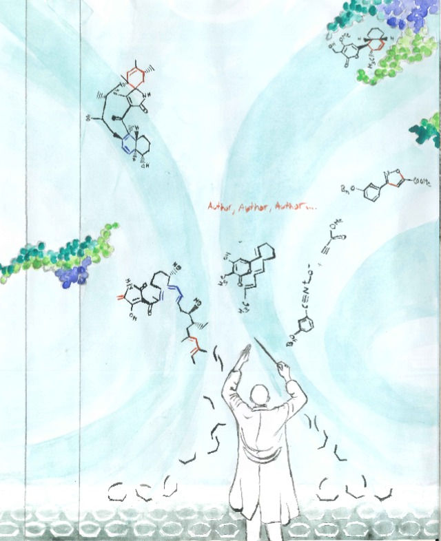
Book cover illustration for a Chemistry Book published by Elsevier, US. 2019.
This is the first time Elsevier has accepted a watercolour painting as their cover. At first, they were skeptical but when they got to see the sketches and hear the symbolic story behind the painting and how it would appeal to chemists in the fields they absolutely loved it.
To read the symbolic idea behind the illustration, see below the images.


The final digital file.


Watercolour painting

The symbolic story behind:
The director/chemist in the centre/front allegory: chemists exploit pericyclic reactions that usually happen through a “concerted mechanism” to get their synthetic target. Cycloadditions are a sub-category of pericyclic reactions. So in a way chemists that are working with cycloadditions (which this book is about) are conductors.
His orchestra at the bottom of the book is a pool of starting compounds for cycloaddition reactions (they are white/unpainted, and dormant).
He’s creating/composing (like music) – summing the compounds into movement (they become black, activated, and move upwards) – above him, they form proper, specific molecules (starting molecules) that go through a cycloaddition reaction and turn into their associated product molecules higher up on the same page (when you follow the flow/movements of the background colours) – these are molecules and reactions mentioned in the book's chapters.
The director/chemist’s powers are influential – putting the whole ‘sky’/background into motion (the green/blue background).
In the background-sky, there are protein ‘clouds’ ready to react with some of the molecules (as many products of cycloadditions can interact with proteins).
I chose to let the movements of the background, the starting compound-pool on the bottom, and the proteins continue around the cover, but I left the back open to allow for the text to fit.
The ‘author’ is written in red underneath the title because in cycloaddition reactions the active/reactive part of the molecule going through the actual cycloaddition is often marked in red – and since the chemists and authors are the designers of such molecules (and active creators of the book) I thought it could be a ‘fun’ idea to also have their names in red. It also harmonizes composition-wise with the red parts of the molecules on the front cover.
The cover was developed advised by chemists of that specific field to make sure it is technically correct and also appealing to that target group.
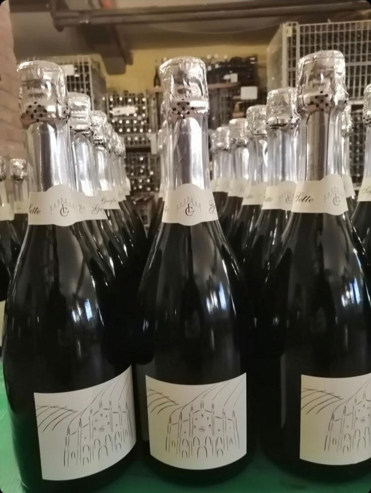
Wine bottle illustration for Locanda del Carmine, 2021.
This was a commission from a gourmet restaurant in the Italian city of Pavia, Locanda del Carmine. They asked me to illustrate the label of their first wine. The wine is produced by Feudonico in Oltrepò Pavese, and the selection/composition of grapes etc. was done by Locanda del Carmine and their sommelier who is the head of the sommelier foundation in this region of Italy.

Wine producer Feudonico, Oltrepò Pavese, for the Restaurant Locanda del Carmine in Pavia, Italy.

The restaurant Locanda del Carmine takes its name from the church of the 'piazza' it is located, Santa Maria Del Carmine, and it is also part of their stylistic logo - therefore the inspiration behind my illustration

After the costumer's wish, I wanted to make it very simple black and white as their logo. The spears of the church are famous, and it's shape recognisable in the area. However, so is the world-famous wine region of Oltrepò. The spears of the church continues as the vineyard - the lines of the rows of wine plants continuing into the horizon.

Simplistic, sketch-like. Incorporating the main characteristic features of the church that is where the restaurant is and makes it famous, as merged with the simple lines of the vine rows of the hills of Oltrepò pavese where the wine is produced.
Mural work in a new concept food store in Pavia, Italy, 2022
La Schita is a new gourmet takeaway food place and concept in a small city in Italy. They have brought an old and forgotten 'poor' recipe back to life and remade it in a playful way with gourmet, slow food ingredients from local producers. They were interviewed and had a long coverage on the main national television Rai1 in Italy because of their concept.

A female sparrow in the cape (colour of the logo of LaSchita) fighting the real villains of this part of Italy which is mosquitos (it is a massive amount of them in the summer, so much they have their own mosquito forecast). The placement is 'hidden' in a non typical place for the costumenrs to 'discover' (thought behind: will get a smile, will have an ownership to it, will create a talk of the town)

The digitalized version (to be printed on post cards and posters for costumers to bring home)

A typical well dressed old Italian man in his Sunday clothes but with some little naughty details - daring to step outside of the old traditions (like Ka Schita does) - as fancy sunglasses, and socks with yellow spots. His little rebellion/playfulness becomes the yellow circles of the Schita themselves (the round bread shapes that are the Schita) and becomes the logo - in line with their playful and out of the box concept.

In Italy it has been the 'nonna' (grandma) that usually made the Schita at home, and they usually cook in general for the whole family etc. In this scenario the Scita of this place are so good (like homemade) that you can order it instead, or in this case she is fishing for 'the moon'/LaSchita - dreaming + listen to music. Opposite roles as it is only men fishing here in Italy, while the old ladies cook at home. Liberating, challenging traditions - and fun.

How they relate to each other on the wall. Playful interaction.

and how it relates to the furniture and setting.

Another angle and how it relates to the place. By purpose small so they do not become dominating in a small place with a lot of 'stuff' already. And also because it requires you come up close to them to 'discover it' and can have a smile (all costumers pay at that counter so they need to pass by it. I have only used the colours of the interior in the illustrations (gray, brown, yellow, dark gray, white)

Here you can see the 'hidden' superhero if you pay extra attention. Subtle and fun. To become the talk of the town like this place has already.
Example of commission work for a private customer, 2021.
Oil painting made on-demand. Size and motive decided by costumer.

Commission to create a small frame oil painting of a picture of the Amalfi coast.


It is a specific place that meant something to someone. It was a gift from someone to that person.